
Word is, Sarasota city employees are thinking of replacing David on the city logo. And spending, according to that article, $25,000 for “design services” to do so.
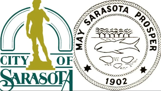
While it’s true, the original logo (still, apparently, the city seal) is rather, well, dated… is David dated? Them folks over in Italy don’t think so!
If you’re not quite sure how a replica statue (and one not even in the original size) might be a symbol of The City of Sarasota, here’s some historic background.
First off, David’s the only one in the Western Hemisphere. And we’re the only Sarasota. That’s worth mentioning. Second, David was created by a 26-year-old dude. That’s rad, right? Like our art and college students. Third, the marble Michelangelo carved into had been sitting around for decades as a “failed project”, rather like, um, the campaign to replace the logo? Here’s some more info on the original.
“Our” David was bought by John Ringling to adorn his never-completed, torn down Ritz-Carlton hotel, and later was repurposed to inspire the art school which didn’t end up being where Ringling thought it should be, so it’s a great example of how Sarasota flows with the times, in my opinion. Here’s the detes.
And finally, David, like the city of Sarasota, always needs to be polished up and conserved. Here’s what the Ringling had to say about that back in the 2020 Giving Challenge season.
BTW, the Historical Society’s hoping you’ll consider our restoration project when you’re choosing your favorite nonprofits during the 2022 Giving Challenge on April 26 and 27.
So, what do you think? Should the city logo change? Back in 2021, 2013, and even 2011, apparently folks thought so. But you know, he’s still standing tall. Like we hope you’ll help us keep the Crocker Memorial Church standing tall and proud as a symbol of our Sarasota community.


Leave David right where he is, at the Ringling and on the logo.
LikeLike
I did Google search for all of the City logos in Florida. Most are fairly ugly. The best ones feature landscapes with boats in the background. My suggestion is to select a landscape scene from a Florida artist such as A.E. Backus or the Highwaymen and use that as the center of the logo. Another possibility would be to use a portrait of Ms. Potter Palmer who was so influential in early Sarasota.
LikeLike
When I screamed at the city commissioners bout this change , I was informed it’s not the David they want to change but the other childlike drawing of a fish and..???
LikeLike
To my understanding, the David is the logo used all over the place (including on some street signs), while the 1902 design is the “seal”…. I know that’s imbedded in the floor, and perhaps as a literal seal on official documents.
Okay, the following is your correspondent’s personal view, and not anything HSoSC has put its seal of approval on: (BTW our logo was done years ago by a volunteer)
Keeping that 1902 seal as a nod to what made us Sarasota is reasonable… it’s not like it’s embroidered on the commissioners’ official polo shirt LOL. It’s a nostalgic thing (and replacing it on the floor? Yikes!)
Changing David as the logo is not just $25,000 in “consult fees” that could be spent elsewhere, but imagine the costs of updating signs, stationery, websites. Energies, attention, and cash better spent on people rather than image.
LikeLike